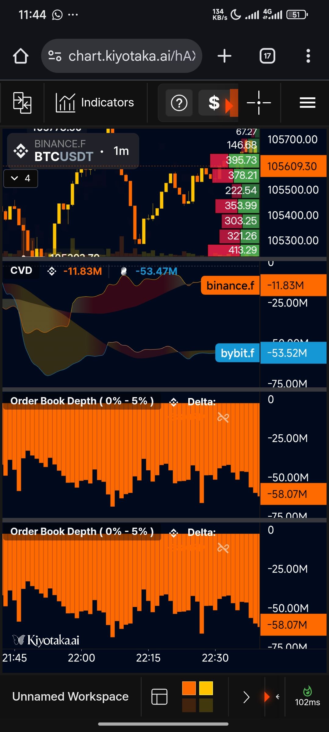
THE LANDING PAGE SHOULD BE LESS DENSE WITH INFORMATION AND MUCH MORE SIMPLER TO VIEW
When loading the site for the first time, the landing page appears to be dense with informations and strong conflicting yellow-ish colours, it would be great if the informations are minimized allowing for users the options to add the kind of analytics tools they'll need after they logging and more distinct colours are introduced (like the normal green for uptrend and red for downtrend on the charts) etc
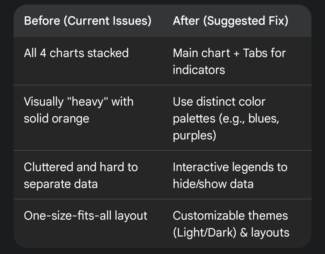
I attached a small table to highlight everything
Share update with 0 linked conversations as well
Upvoters
Status
In Review
Board
💬
Feedback
Date
7 months ago
Author

laegend
Subscribe to post
Get notified by email when there are changes.
Upvoters
Status
In Review
Board
💬
Feedback
Date
7 months ago
Author
laegend
Subscribe to post
Get notified by email when there are changes.