TPO only charts (+ more colors customization)
Attached is a comparison between the same period on the TPO (october 29, 2025). TPO only charts would fix many issues and make it better for market profile traders.
The biggest changes it would enable:
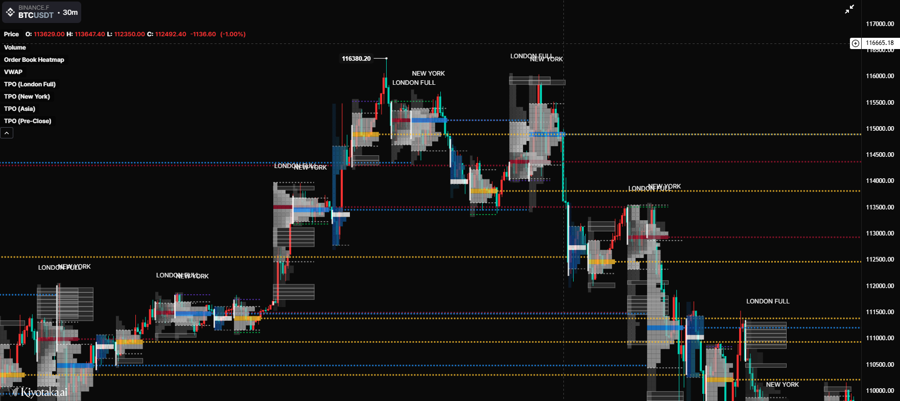
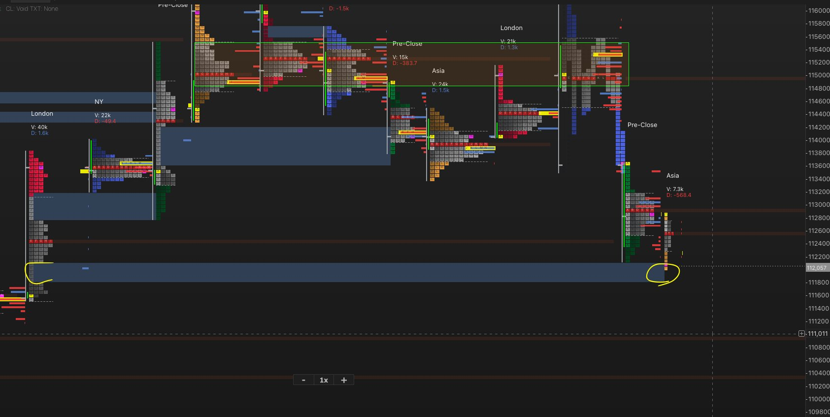
-expanded profile charts (as you can see on the second screenshot, at the last NY session.)
-Spacing: this is the most important for me because if one wants to have full session profiles without overlapping, then having tpo only charts is mandatory. As you can see on the first screenshot i used kiyotaka’s session profiles with full london sessions as an example. But it’s the same for every session if you take the full one then they overlap and getting any signal out of that becomes hard. Of course, sessions overlap by definition in terms of hours but as TPO users we prefer to have for instance an NY session and a London session with their full extent next to each other (even if blocks repeat within both) so as to have more context. It can very noisy in the case where candle charts are still the template for TPOs. Which is why TPO only charts would be a huge plus for the platform on itself
The second part is on colors: it would be nice to be able to have a different color for value area and non value areas of TPOs (see second screenshot for instance). I’ve seen many traders regretting it wasn’t an option yet (like TheFlowHorse on X)
Share update with 0 linked conversations as well
In Review
Feature Request
6 months ago

An Anonymous User
Subscribe to post
Get notified by email when there are changes.
In Review
Feature Request
6 months ago
An Anonymous User
Subscribe to post
Get notified by email when there are changes.